During a recent conversation with a friend, our discussion shifted towards investments, more precisely to the recent NFO of the SBI Nifty 50 Equal Weight Index fund, in which he had invested. He suggested that I consider the same, highlighting a notable difference from the regular Nifty 50 – in the standard Nifty 50 constituents are weighted based on their market capitalization resulting in a bias towards a few heavyweights. However, in the Equal Weight Index fund, each constituent carries equal weight, ensuring better diversification.
He later shared a chart from an advertisement of this NFO, comparing the returns of Nifty 50 (referred to as N50 hereafter) with Nifty 50 Equal Weight (N50EW) over the past 20+ years. The chart underscored that N50EW delivered superior returns “over the short and long term” – 16.4% compared to N50’s 14.1% (see below).
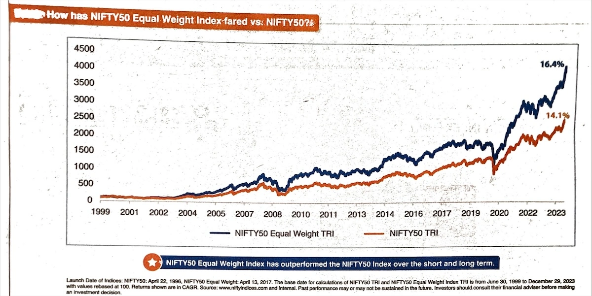
Now if there is one thing that I have learned in my career in analytics, it’s that you can make the data speak whatever you want. Fortunately, NSE offers historical data for all scrips and indexes. So, I decided to analyze this myself, with three key objectives in mind.
Objective of the analysis:
- To identify if the chart shown in the ad is correct.
- If the chart is correct, assess if this is the right way to look at the data.
- If not, how should the data be analyzed and what insights can be drawn?
Duration of the analysis:
Same as that of the ad, i.e., from 30th Jun 1999 to 29th Dec 2023.
Data:
I am using TRI (Total Return Index) data for both N50 and N50EW, which can be downloaded from the NSE website here.
The Total Return Index (TRI) is a financial index that shows how well an investment is doing by considering both changes in its price and any income it generates, like dividends.
Unlike regular stock indices (Nifty and Sensex), which only focus on price changes, TRI provides a more complete and accurate picture of your overall return on investment by taking into account both the price changes and any income you receive from your investment (e.g. dividends).
Objective 1: Verify if the chart shown in the ad is correct.
I plotted the data that I downloaded from NSE’s website on Google Sheets. After some tweaks, I was able to recreate the chart. This is how they (and I) did it:
- Put the Nifty 50 TRI and Nifty 50 Equal Weight TRI data in a sheet and rebase it to 100.
- Calculate the cumulative return for both indices (CAGR) using the compound interest formula:
(Final Value / Initial Value) ^ (1/number of years) - 1
Here is the same chart recreated by me on Google Sheets:
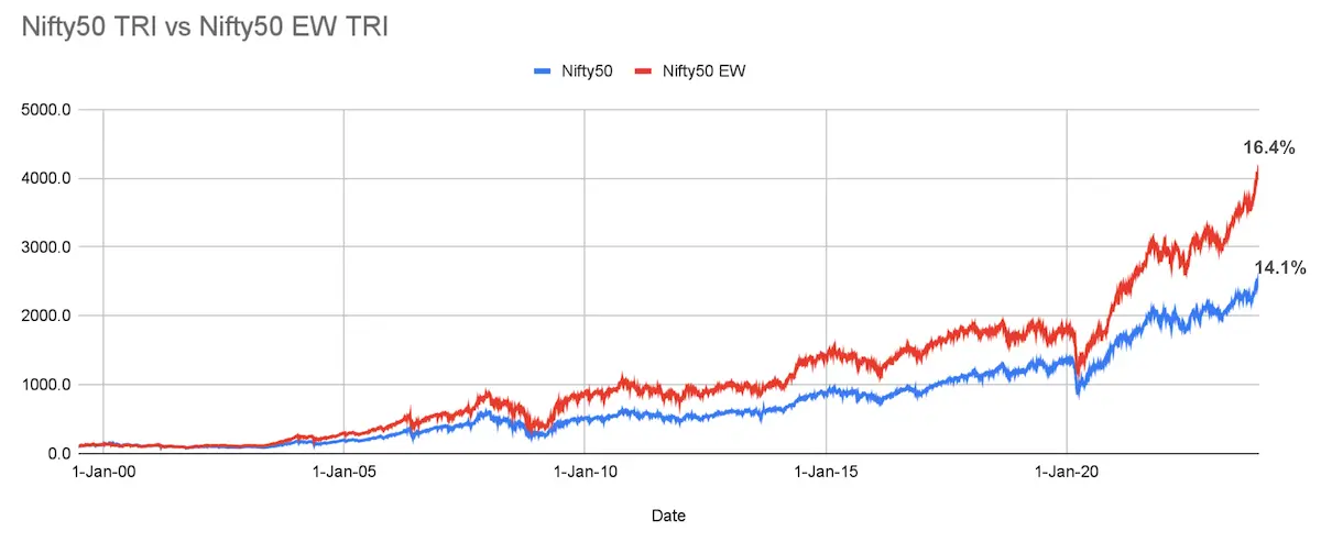
Conclusion: The chart in the ad is accurate insofar as the underlying data is concerned.
Objective 2: Is this the right way to look at the data?
Let’s pause for a sec and ask ourselves: are we really seeing the whole picture with this chart?
That chart up there gives us point-to-point return, also known as trailing return. It tells us that if we invested Rs 100/- on 30th Jun 1999 in the Nifty 50 and Nifty 50 EW index, by 29th Dec 2023 it would be Rs 2542/- and Rs 4145/- respectively. But, it overlooks what happened in between, ignoring the journey these indices took.
However, in investment, the journey is equally important. Imagine a train from Delhi to Lucknow with stops at Agra, Etawah, and Kanpur. It starts on time but is delayed by an hour at Agra and 3 hours at Etawah. Eventually, it catches up and arrives on time in Lucknow. For someone who got on in Delhi and got off in Lucknow, it would have been a pleasant experience. But if you boarded at Agra and got off at Etawah, this would have been a frustrating journey.
Just like how your train ride experience depends on when you get on and off, your investment journey also matters, as your return could vary greatly depending on when you enter the market, for how long, and when you exit. We need to consider what occurred between those two dates to grasp the true performance.
Conclusion: Looking solely at the endpoints isn’t the right approach to evaluate the performance of the funds.
Objective 3: What is the right way to evaluate the performance of the Nifty 50 Equal Weight Index?
This is where the rolling return comes into play.
Rolling returns are point-to-point returns calculated on a chosen frequency such as daily, weekly, or monthly for a specified period. Instead of focusing on a single fixed period rolling returns look at returns made at various points in time in the past and give a comprehensive picture of a fund’s performance.
Since markets go through ups and downs, rolling returns would tell us how the fund performed through both good and bad periods and make it more indicative of the actual performance of the fund. It would be hard to understand this using the returns of just one period. But calculating rolling returns requires a lot of data crunching making it difficult to calculate.
To evaluate whether N50 EW consistently outperforms N50 over the long term (as suggested in the ad), I did a comparative analysis of the 10-year and 20-year daily rolling returns of both indices on Google Sheets.
Analyzing the 10-year Daily Rolling Return:
In this assessment, I calculated the returns for a rolling 10-year window, i.e., from 30/06/1999 to 30/06/2009, then shifting forward by one business day to calculate the returns from 01/07/1999 to 01/07/2009, and so forth, until reaching the final period from 27 Dec 2013 to 27 Dec 2023. This resulted in a total of 3623 such windows.
| Return Consistency (% of times) | Total Windows = 3623 | ||
| Nifty 50 TRI | Nifty 50 EW TRI | |
| Negative Return | 0% | 0% |
| Sub-Optimal Return (0-8%) | 4% | 9% |
| Return in the range 8-15% | 54% | 46% |
| More than 15% return | 42% | 45% |
| 10-Year Return Summary | ||
|---|---|---|
| Nifty 50 TRI | Nifty 50 EW TRI | |
|
Min 10-Year Return
|
5.13%
|
2.71%
|
|
Max 10-Year Return
|
22.42%
|
27.08%
|
|
Avg Rolling Return (Median)
|
14.18%
|
13.94%
|
The two tables tell us that Nifty 50 Equal Weight gave good returns (>15%) more times than Nifty 50, but it also gave sub-optimal returns more times than Nifty 50. While the upside was more in the Nifty 50 Equal Weight fund, so was the downside.
The chart below compares the 10-year rolling return on Nifty 50 TRI and Nifty 50 Equal Weight TRI.
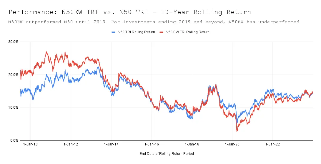
Note: When plotting rolling returns, the convention is to use the end date of each rolling period on the x-axis of the chart. The y-axis represents the calculated returns for each rolling period.
It is clear that while the Nifty 50 Equal Weight index has outperformed the Nifty 50 until 2013, its recent performance is nothing to write home about. The chart below makes it even clearer by showing the delta in return between the two indices (i.e., the difference between the red line and blue line in the above chart), which kept reducing over the years, became negative since 2019, and is only now catching up.
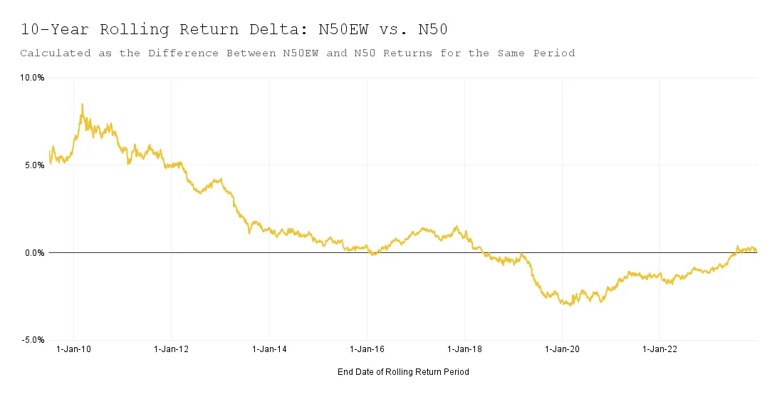
Conclusion: Nifty 50 gave a more balanced return than the Nifty 50 Equal Weight index over a 10-year duration. More recently, there were periods when the Nifty 50 gave better returns than the Nifty 50 Equal Weight index.
Analyzing the 20-year Daily Rolling Return:
Here I calculated the returns for the 20-year duration from 30/06/1999 to 30/06/2019, then shifted forward by one business day to calculate the returns from 01/07/1999 to 01/07/2019, and so forth, until reaching the final period from 29 Dec 2003 to 29 Dec 2023. This resulted in a total of 1130 such windows.
| Return Consistency (% of times) | Total Windows = 1130 | ||
| Nifty 50 TRI | Nifty 50 EW TRI | |
| Negative Return | 0% | 0% |
| Sub-Optimal Return (0-8%) | 0% | 0% |
| Return in the range 8-15% | 42% | 27% |
| More than 15% return | 58% | 73% |
| 20-Year Return Summary | ||
|---|---|---|
| Nifty 50 TRI | Nifty 50 EW TRI | |
|
Min 20-Year Return
|
9.80%
|
12.01%
|
|
Max 20-Year Return
|
17.99%
|
19.81%
|
|
Avg Rolling Return (Median)
|
15.71%
|
17.13%
|
The above two tables indicate that the Nifty 50 Equal Weight index provided a better return than the Nifty 50 index.
Let’s now compare the 20-year rolling return for the two indices.
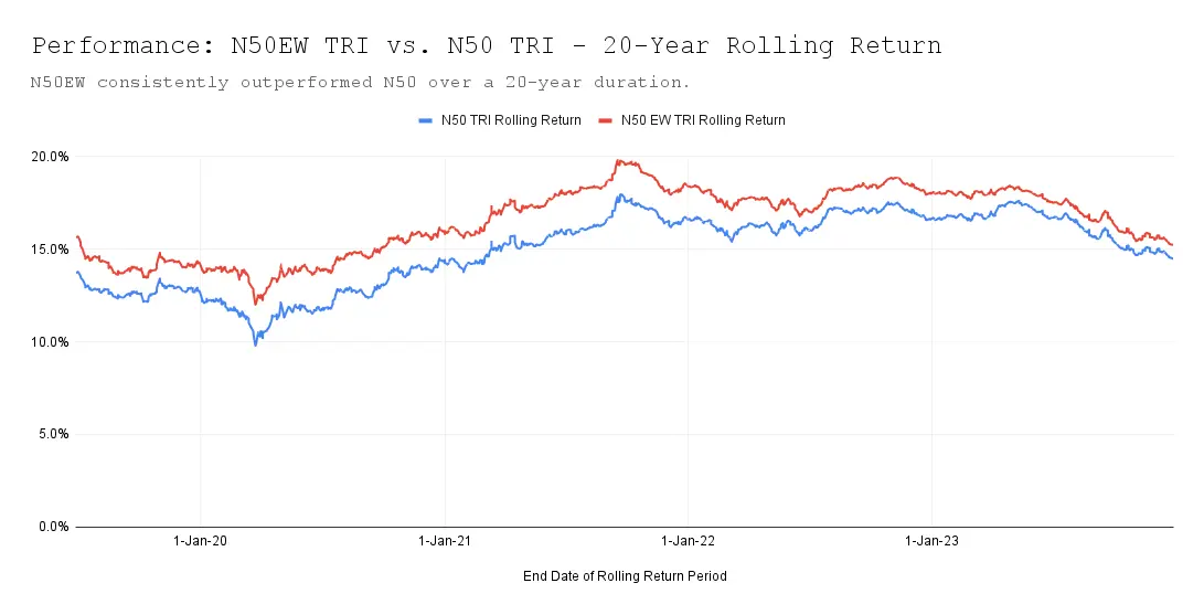
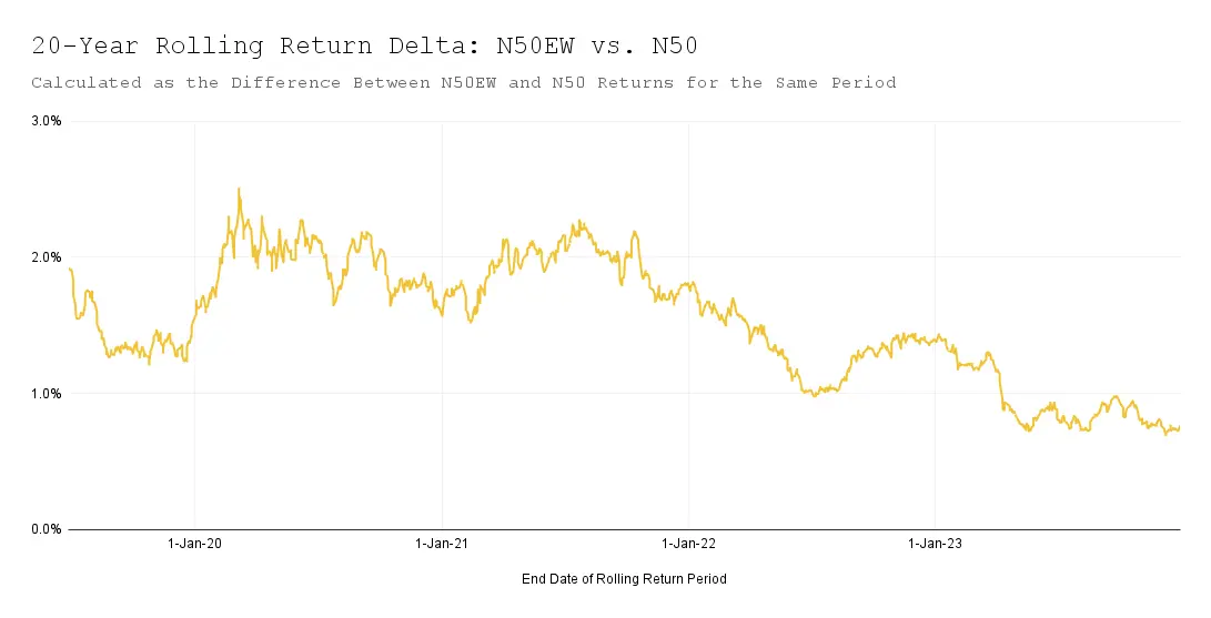
Checking out these charts, it’s pretty clear – the Nifty 50 Equal Weight index has performed better when compared to the regular Nifty 50 for a 20-year-long investment horizon. But here’s the kicker – the gap between them has been decreasing gradually, and even hit below 1% recently.
Conclusion: Nifty 50 Equal Weight gave better return consistently than the Nifty 50 index over a 20-year duration. The difference in the return has gone down in the recent past.
Final Conclusion
For longer duration – 20+ years – the Nifty 50 Equal Weight index has outperformed the Nifty 50 index. However, the performance gap between the two has been narrowing since 2021 and is currently less than 1%. If you have a long investment horizon, around 20 years, the Equal Weight index might be a preferable choice over the Nifty 50 index.
Before you dive in, though, it’s crucial to consider the expense ratio of these funds. Mutual funds that invest in Nifty 50 index, like UTI Nifty 50, have a low expense ratio since the fund manager doesn’t actively manage it. On the other hand, funds linked to the Nifty 50 Equal Weight index require more active management from fund managers to maintain an equal distribution of all 50 stocks. This could result in a higher expense ratio, thus offsetting any gains from such funds.
For instance, the UTI Nifty 50 Index Fund has an expense ratio of 0.21% while the Nifty 50 Equal Weight Index Fund from the same fund house has an expense ratio of 0.55%.
Given these considerations, I’m currently not too inclined to invest in Nifty 50 Equal Weight funds. However, I plan to reassess this decision in a year.
What are your thoughts on my analysis? Feel free to share your insights through the comment form below.
Thanks for reading! I’d love to hear your thoughts in the comments below. If you found this useful, please share it with anyone who might benefit from it.
Want to stay in the loop?
To get notified when I publish my next article, you can subscribe to my newsletter here. I send an email every few weeks when I publish something new – just links to articles I’ve written, and occasionally, books or articles I found worth reading.
Photo Credit:
Feature Image: Photo by Markus Spiske on Unsplash


